
26% → 59%
Trial-to-paid conversion, in three months
Taxfix is Germany's leading mobile tax app, used by more than a million people. It sells two very different products: file your taxes yourself, or hand them to a certified tax expert. The onboarding, built years earlier for one product, still funneled everyone down a single path. I embedded with the Activation team to merge the two experiences into one onboarding where the choice is actually a choice.
Book a free intro call →
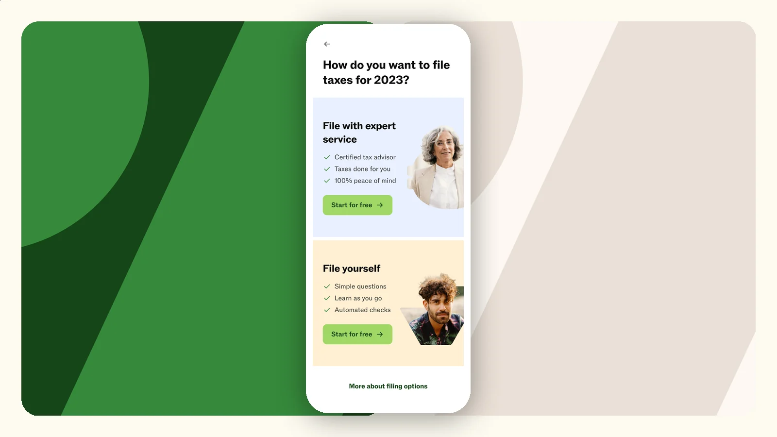
Taxfix built its name on one sharply-scoped product: answer simple questions, file your German tax return yourself. Then it added a second, very different one - a “done for me” service where certified tax experts prepare the return for you. Two products, two prices, two entirely different promises.
The onboarding did not get the memo. New users, including those arriving from campaigns for the expert service, landed in a flow designed when self-serve was the only option. The company planned to acquire users with “assisted intent” at scale in Q1 - straight into a funnel that never showed them the thing the ad promised.
I joined the Activation team as a fractional Senior Product Manager, reporting to the team's Product Director. The mandate: merge two onboarding experiences into one multi-product onboarding, from concept work to shipped experiments.
Merging two onboardings is not a screen-design problem. It is a sequencing problem: when does the choice appear, what does a user need to understand first, and what protects you when you get it wrong?
The product choice sat at the very start of the flow, before users understood either option. Choose wrong and they churn - or opt into the expert service, realize mid-flow it is not what they wanted, and back out. The team had a name for that: product regret.
Q1 marketing was about to acquire users expecting an expert to do their taxes. The onboarding showed them a self-serve product first. Losing exactly the users the company was paying to acquire was the specific fear.
All of this had to happen during the tax-season peak, on mobile, in the weeks that make the company's whole year. A careless experiment would not just fail - it would cost real revenue at the worst moment.
The work ran like discovery should: a wide option space first, ruthless prioritization second, and live experiments with guardrails as the only source of truth.
“One concept lifted expert bookings and quietly dragged everything else down. The guardrail metrics were the whole point - they turned a plausible story into a clear no.”
The personalized recommendation lifted expert-product selection - and hurt overall booking and activation, while the product-regret signal showed users did not realize they had made a choice at all. It was switched off and reworked instead of quietly shipped.
The “What's new” concept proved harmless to the core metrics while lifting interest in the expert product - and became a permanent feature for showing returning customers what changed since last season.
Cohort definitions, a multivariate testing plan, and the next concept designed and scheduled. The experimentation program outlived the engagement, which is the point of embedding a fractional PM in the first place.
Most teams bolt the new product onto the old flow - a banner, a toggle, a second button - and call it a multi-product experience. The real work is deciding when the choice appears, what a user has to understand before they can make it, and which guardrail metrics protect you from a concept that flatters one number while quietly bleeding three others. If you are acquiring users whose intent does not match your default funnel, that is not a design chore. It is a discovery problem, and it deserves to be treated like one.
26% → 59%
Trial-to-paid conversion, in three months
+44.7%
Free-to-paid conversion from one experiment, tested on 120,000 users
80% → 60%
Onboarding drop-off at the pre-KYC screen
0 → 1,000
Active B2C users in the first year
12
Prioritized recommendations, sequenced into a build-ready roadmap
Book a free intro call and we'll look at where the choice should actually live - no pitch deck, just your actual flows.
Book a free intro call