Before Desertcart Bet on a New App, We Handed It to Real Shoppers.
Desertcart is a Dubai-based marketplace that ships hard-to-find products to the UAE and beyond. With a redesigned app, a new visual direction, and a paid “Pro” tier all on the line, they needed to know one thing before launch: would real shoppers actually get it? We ran the research to answer that — and handed back a prioritised roadmap, not just opinions.
Book a free intro call →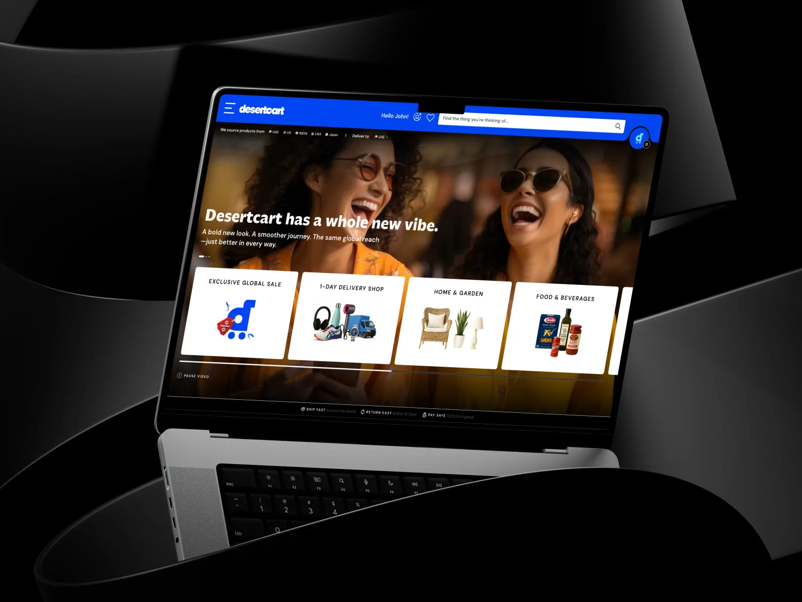
A global marketplace, betting on a bolder experience
Desertcart lets shoppers in the UAE and beyond buy products that are otherwise hard to find in the region — a huge, global catalogue delivered locally. To grow, the team had reimagined the mobile experience: a cleaner, more expressive design, new AI-powered features, and a paid “Pro” membership. It was a big bet — and betting on a redesign without testing it is how good ideas quietly lose money.
Three questions, one relaunch riding on the answers
Desertcart didn't need opinions — they needed evidence. Before committing engineering to the relaunch, three things had to be de-risked:
Does the new app make sense?
Could real shoppers navigate the redesigned prototype, find what they wanted, and grasp the new features — without a guide?
Which visual direction wins?
Two brand directions were on the table — expressive vs. minimalistic. Which one actually helped people shop?
Will anyone pay for Pro?
The new paid membership had to convert. What would make shoppers say yes — and what was quietly killing the upsell?
Eight shoppers, thinking out loud
We ran eight moderated, remote think-aloud sessions — four with existing Desertcart shoppers and four with first-time visitors — watching real people use the prototype live, narrating every hesitation, misread, and “wait, where's the search?” moment. We recruited across four distinct shopping behaviours too, so the findings held across the customer base, not just one type of buyer.
Peter
Power buyer, mobile-first — shops often, moves fast, low patience for friction.
Sailee
Snack hunter, desktop-first — browses for niche finds on a bigger screen.
Frank
Trust-focused health shopper — needs reassurance on authenticity and pricing.
Anvaya
Price-sensitive essentials buyer — weighs every fee before committing.
What clicked — and what quietly cost conversions
The redesign got a lot right. But the moments that break trust in a marketplace — a hidden search, a price that changes at checkout — were exactly the moments that tripped shoppers up.
Validated — what shoppers loved
The new look landed
Cleaner UI, clear hierarchy, and instant price + savings on every product tile.
AI Photo Search was a hit
Testers kept calling it “powerful and convenient” — a genuine differentiator worth leaning into.
Pro perks read clearly
Badges, perk lists, and free-shipping labels made the membership's value visible at a glance.
Local theming resonated
Seasonal touches like the Eid banner and regional models felt made-for-me.
Friction — what tripped them up
The search bar hid
A shopper's first instinct is to search — and they couldn't find the search.
Prices didn't match
Listing price ≠ cart price. Nothing erodes trust in a marketplace faster.
Onboarding felt like ads
Splash screens got in the way — and desktop users were shown a mobile-only flow.
New features went unexplained
A cryptic “AI Find” label meant a great feature quietly went undiscovered.
The same app, two different jobs to do
The sharpest finding wasn't about a button — it was about who's tapping it. Existing shoppers had already banked their trust, so they optimised for speed. For first-timers, trust was the whole task. Same prototype, two very different jobs to do.
Trust is banked — make me fast
- Optimise for speed and consistency: visible search, snappy filters.
- Loved the expressive look — colour pop and the savings tracker.
- Pro-ready: the most likely to convert to paid membership.
- Want a skip-able, efficiency-first onboarding.
Trust isn't banked — prove it first
- Legitimacy first: brand story, returns policy, payment options.
- Preferred a cleaner, minimalist look — it reads as safer.
- Need localisation: local currency, clear duties, familiar payment (UPI).
- Want a short, educational intro before any premium ask.
Our synthesis for the team: one core funnel, three tuning dials — show instant value to heavy buyers, surface legitimacy signals for first-timers, and localise fees and payment methods per market. (One caveat we flagged honestly: existing users skewed UAE and new users India, so tenure and market overlap — worth isolating in a follow-up round.)
Expressive or minimalistic? Wrong question.
“Visual style doesn't change what shoppers actually need — trust, speed, and clarity. New visitors leaned minimalistic; power users just wanted efficiency. The winning direction wasn't one or the other. It was expressive warmth on a minimalistic structure.”
12 fixes, ranked by what to do first
We didn't hand over a wish list. We handed over a prioritised roadmap — what to fix now, next, and later — each tied to a real user and a real moment of friction.
Fix the trust-breakers first
- Make search omnipresent and sticky, on mobile and desktop.
- Skip or shorten the onboarding splash screens.
- Lock “the price you see is the price you pay” across every screen.
- Rewrite the fee and duty banner in plain English.
Earn confidence, then upsell
- Trigger Pro promos for episodic shoppers at the right moment.
- Add real-time stock and delivery alerts.
- Rename and explain new features — goodbye, cryptic “AI Find.”
- Batch filters into a single refresh for speed.
Deepen the reason to come back
- Rebalance the catalogue and expand everyday essentials.
- Introduce transparent, capped shipping tiers.
- Add a price-match / “found it cheaper?” flow.
- Sharpen how Pro's value is communicated.
Turning a nice-to-have into a yes
The paid membership had real appeal — but doubt was quietly winning. Shoppers were pulled in by free shipping, a visible savings tracker, priority-delivery badges, and risk-free cancellation. They were held back by three things: “it's not worth it if I only shop now and then,” fuzzy benefit math, and a real fear of hidden auto-renewals. The play we recommended: surface the savings, prove the flexibility up front, and time the upsell to a moment that already stings — like a big shipping fee at checkout.
A relaunch backed by evidence, not hope
A build-ready roadmap
Prioritised fixes, sequenced Now / Next / Later — not a wish list.
A clear brand verdict
Expressive warmth on a minimalistic structure — decision made, not debated.
Audiences decoded
Existing vs. new shoppers — each with its own onboarding and Pro strategy, not one-size-fits-all.
Desertcart went into its relaunch knowing what worked, what would quietly cost conversions, and exactly what to fix first — before a single engineering sprint was spent on the wrong thing. That's the whole point of testing before you ship: the cheapest bug to fix is the one you catch in a prototype.
A redesign you haven't tested is just an expensive opinion
It's easy to fall in love with a new design in Figma. It's expensive to find out — after launch — that shoppers can't find the search bar or don't trust the price. Four well-run sessions cost a fraction of a botched relaunch, and they turn “we think” into “we watched them.” If you're about to bet on a redesign, a rebrand, or a new paid tier, that's the cheapest insurance you can buy.
About to bet on a redesign? Test it first.
Book a free intro call and we'll figure out what's worth testing before you build it — no pitch deck, just your actual product.
Book a free intro call.svg)
.svg)
